Visualizations
Phrazor allows you to create appealing visualizations to enhance your dashboards
Create Visualization
- Within your project, Switch to Edit Mode. You should see a screen like this
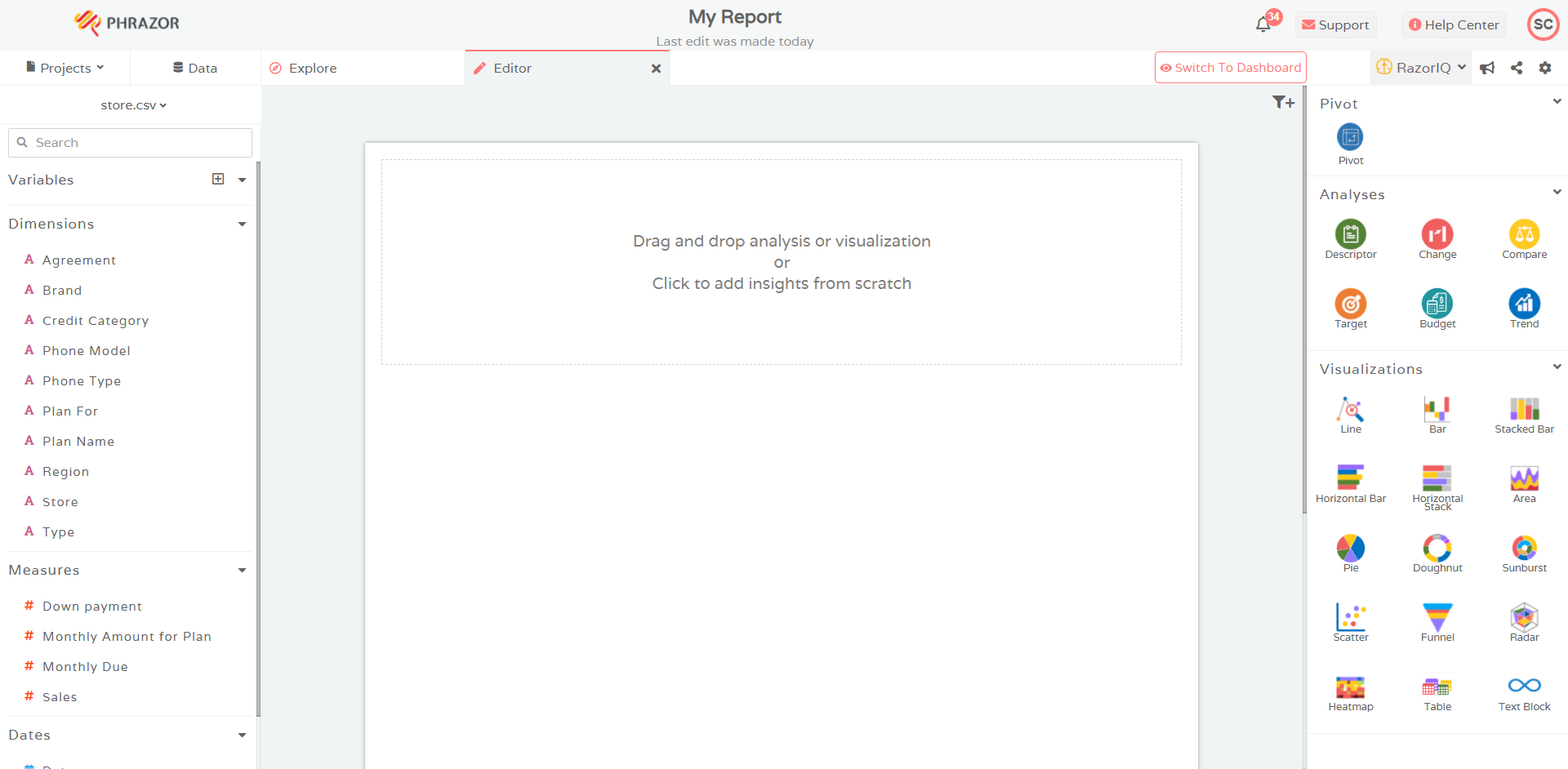
- From the list of Visualization options present within the right panel of the screen, drag a Visualization into the Editor
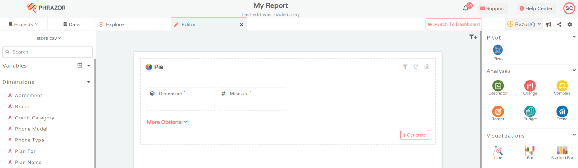
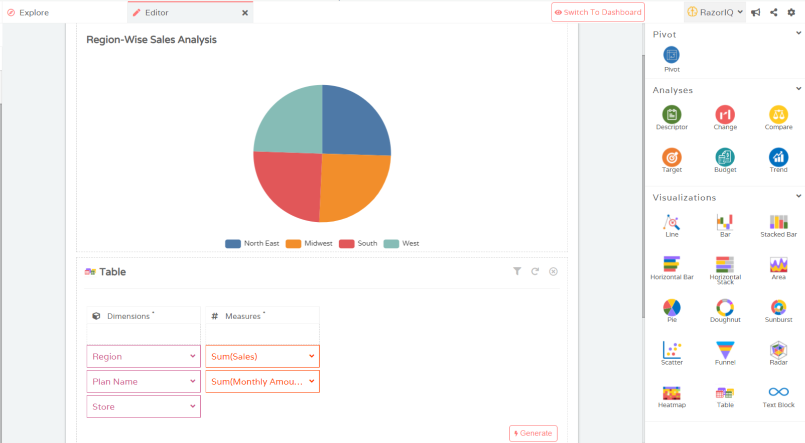
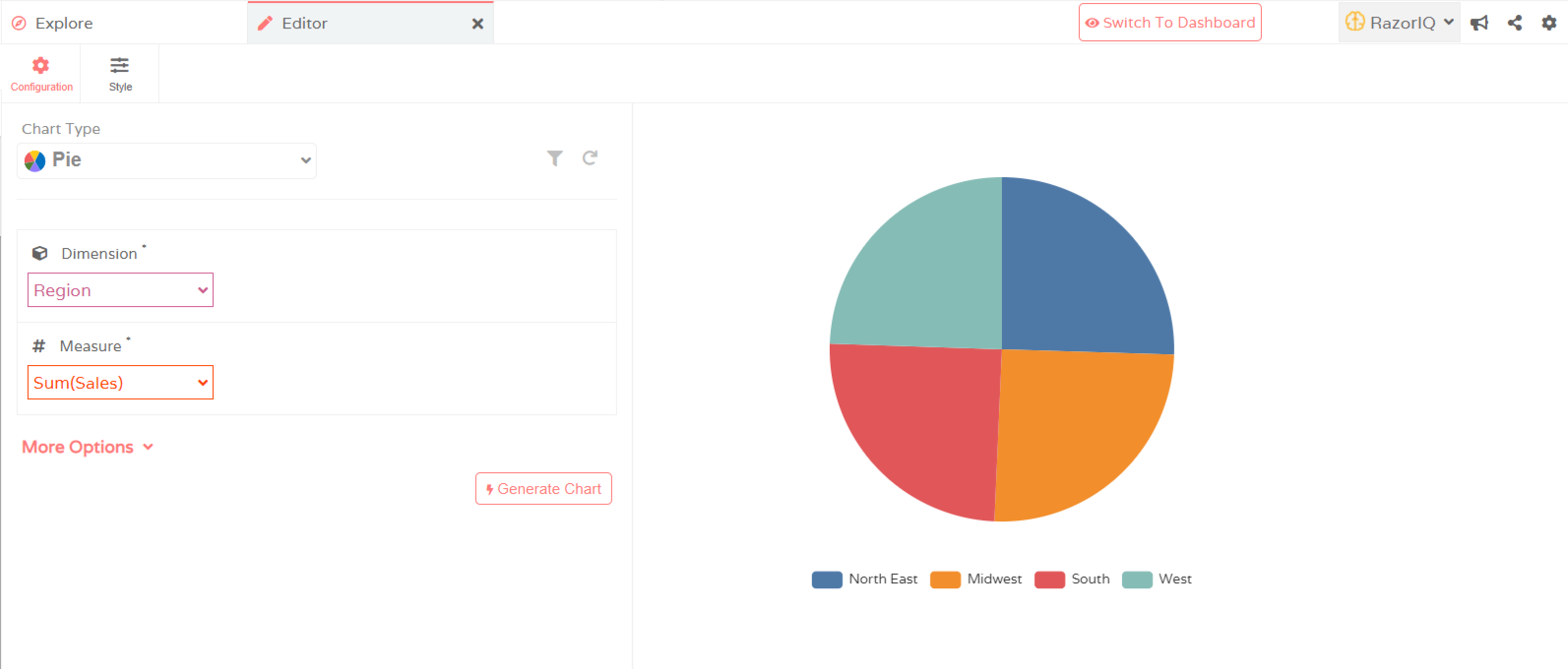
- Select Dimension and Measure. Should you want to customize your requirements even further, you can do so through More Options
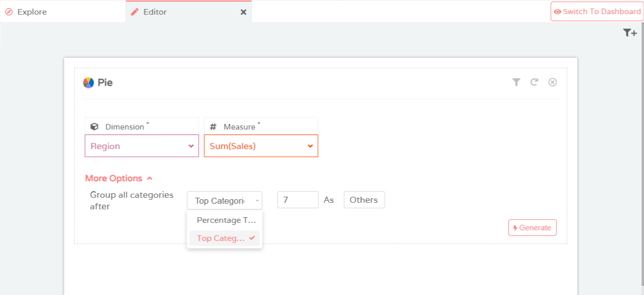
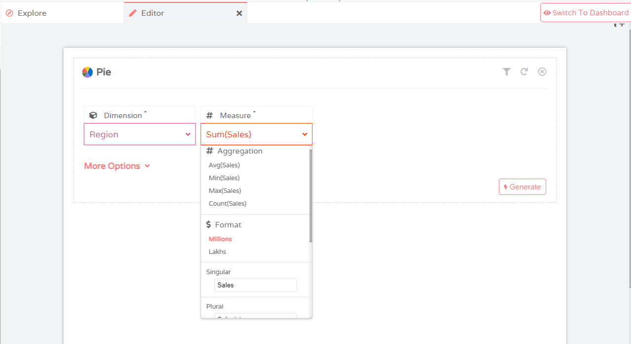
- You can select the type of type of aggregation under Measure and also rename the columns which will be reflected accordingly in the visualization
- Click on Generate. Your visualization is ready
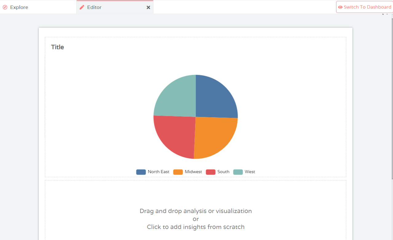
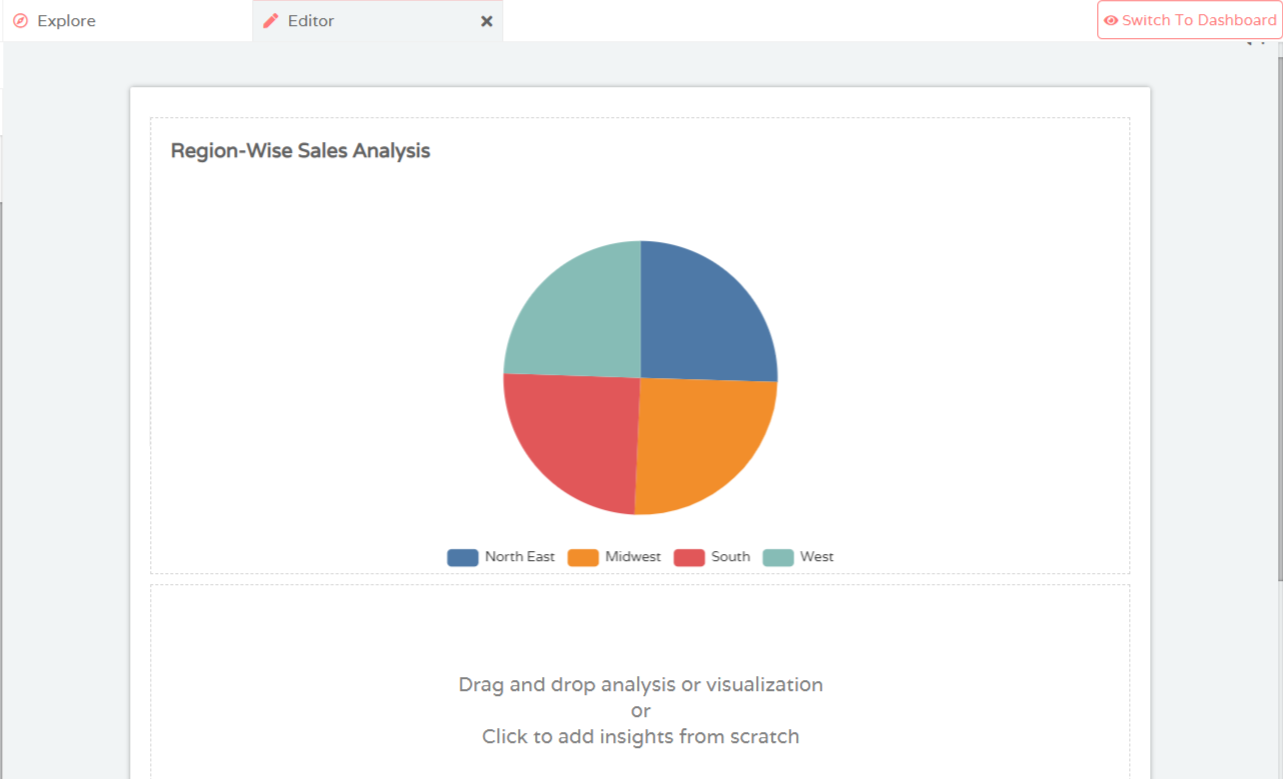
- Edit the Title to match the contents of the visualization
Edit Visualization
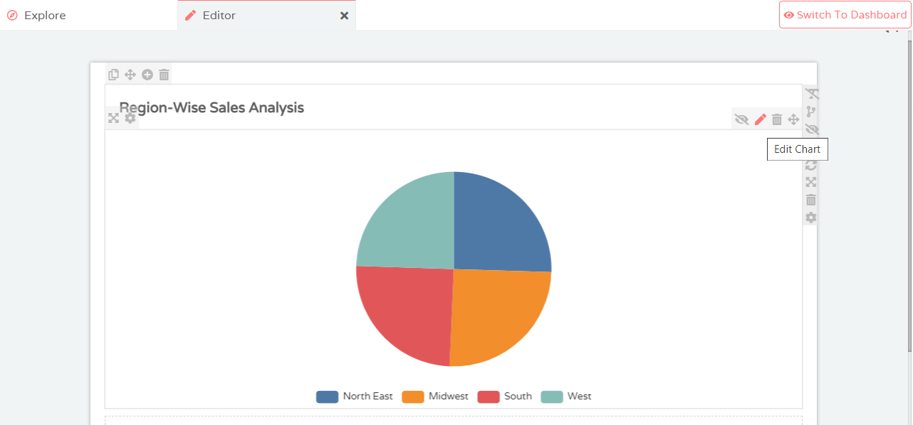
To reconfigure the inputs of your visualization, hover over the visualization and select Edit Chart. Multiple options to edit your visualization are presented
Customize Visualization
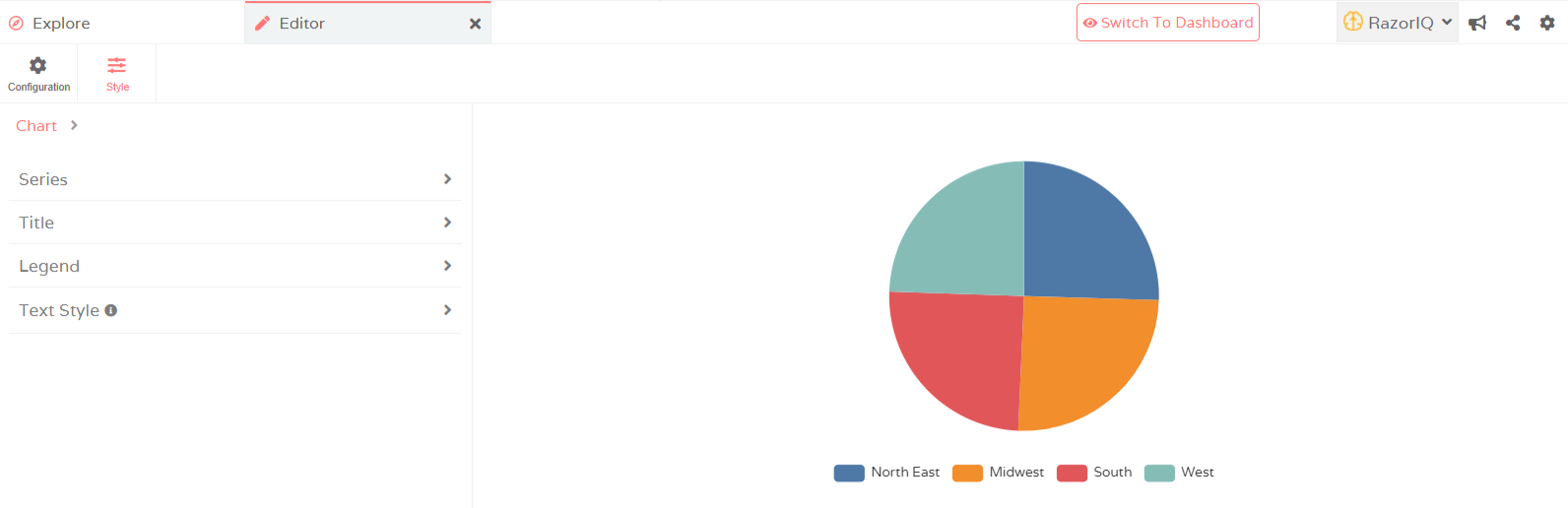
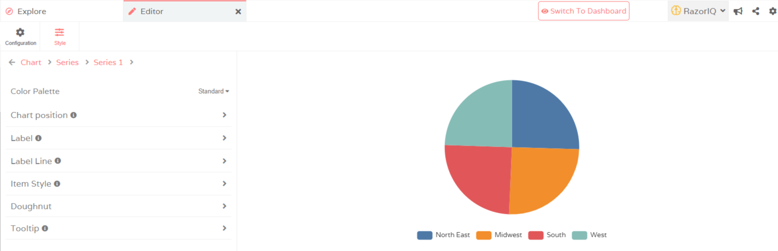
You can customize the properties of your visualization by clicking on the Style option within the Editor. Each header contains multiple additional customization controls which you can use to customize further. Remember to Save all changes you make
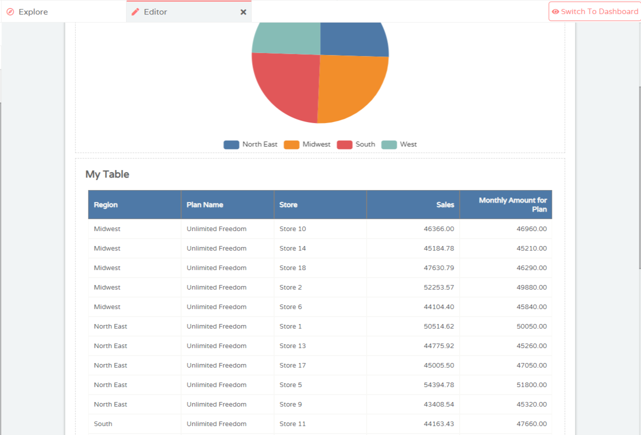
Table
The Table option is visible on the right side of your screen under Visualizations. You can drag & drop the Table option into your Editor and provide multiple Measures and Dimensions at the same time. Options for editing and styling Table is the same as explained under the header Customize Visualizations