2021-05-27 00:00:00
5 min read
Is your dashboard doing its job to help you optimize your performance? Before we can delve into the importance of dashboards, let us understand what they are and how they help with complex data management.
What are dashboards?
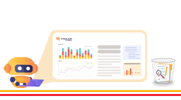
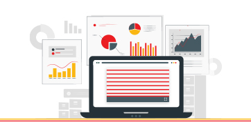
A BI dashboard, or a Business Intelligence dashboard, is a data visualization solution predominantly used to analyze the data at hand. They help curate easily comprehensive data analysis, enable the user to customize the information they want to be displayed, and offer the ideal way to share the analysis results with other team members. Dashboards come with interactive elements such as filters and action to combine graphs, charts, and reports that content creators can utilize to project overviews. They are designed to help organizations translate complex data easily understandable and approachable for users. But there often comes a time when the dashboards don’t perform to their optimum capabilities. Why does this happen? Understanding the challenges and problems resulting in the inability of dashboards to function is what we are here to cover.
We have compiled a list of scenarios that can be used as a diagnostic tool to assess why dashboards don't seem to work in your favor and how you can avoid these problems.
1. Streamline the target audience
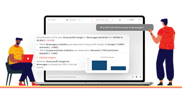
Tailored information disbursement is one of the primary roles of dashboards. Often, dashboards are required to serve a wider audience, with users coming from different functional teams. The information retrieved from the data about social media could be valuable to the social media department but might not necessarily have the same relevance to the SEO team though both are a part of the digital marketing team. Every user from multitudes of teams and roles will have different information to extract from the data. Hence, by specifying an audience, a role-based dashboard can help overcome this challenge and deliver personalized automated reports, similar to the ones provided by Phrazor. These automated reports will be streamlined for the interpretation of individuals and their needs.
2. The analytics team spends more time on reporting instead of analyzing
The job description of an analyst extends to analyzing the data, drawing inferences, reporting, and finding critical insights to help businesses. However, it has been observed that many analysts spend the majority of their time building dashboards that report the past instead of analyzing the data. When analyzing data, the question of 'what next?' needs to be answered. This process does not empower the resources hired to get those vital actionable insights that would help managers make better decisions and help businesses gain more from their data.
3. Add contextual data to derive the desired results
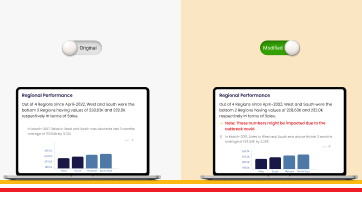
Contextual data enables a broader understanding of a specific problem and offers precise information that is required to support the users in their decision-making. Analysts need to ensure that adequate context is provided for actionable responses from dashboards. Only after adding background information to essential metrics such as period-over-period comparison studies, industry benchmarks, and targets, audiences can gain a deeper perspective on the results displayed by dashboards. Contextual analytics with relevant holistic information is the key to getting a more accurate report. Natural Language Generation-based BI tools such as Phrazor, leverage contextual data to reveal hidden insights and recommend actionable responses through smart automated reports.
4. Inputs on data interpretation
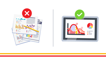
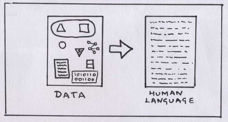
A company has various levels of domain expertise and data literacy across its spectrum of users. Due to this, not everyone is well-equipped to understand how data can be interpreted or what metric needs to be measured to get desired results. For this, it is important to demonstrate how data needs to be interpreted. Lack of knowledge or rather no explanation of data in the form of visualizations or incomprehensive reports would make it cumbersome to interpret, leading to a less inspired action report. However, dashboards help ease the process. For instance, Phrazor uses natural language generation technology to produce automated reports in plain English. Basically, by transforming structured data into stories, the tool generates words and visuals that provide hidden insights and also recommend actionable narratives for a layman's understanding.
5. Recommend solutions and actionable insights
Time and again, insights are easily discernable from the data. However, a direction or the right course of action is not explained. Dashboards can recommend actions that individuals can take based on specific insights. Automated recommendations and reporting is a boon that many dashboards usually possess. Additionally, the tools also enable automation and distribution of bulk reports for various stakeholders involved in the management front. So, you need to ensure that your dashboard is providing a narrative layer to make reports communicate effectively. Reports generated by Phrazor are produced by using augmented analytics and hence, are concise and accurate.
6. Enhance filtering options with the relevant flow of questions
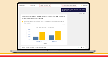
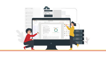
The game of probability comes into play here as designers need to follow a users' natural curiosity and logical line of questioning when curating dashboards. By first designing a clear visual hierarchy within the dashboard, audiences can easily navigate the content. For the same, an inverted pyramid approach is often used as one can start with high-level KPIs (Key Performance Indicators) and break them down into relevant dimensions. This approach helps tie loose ends and enhances the filtering options to guide users towards the insights they seek. To get you started off on the right foot Phrazor’s Wizard feature can generate a comprehensive report with just a click of a button taking into consideration the purpose of the report and various data hierarchies and entity correlations.
7. De-clutter the dashboard
For easier consumption, it is imperative that the dashboard remains organized. Much like any other discipline in life, a cluttered dashboard is daunting to a new or even a veteran user. Such dashboards will surely scare away any user before they even press go to explore the data! Clutter of all forms needs to be removed to enable a seamless and less taxing operation and gain optimum insights. This means a reduction in the number of charts and data visualization techniques at a macro level.
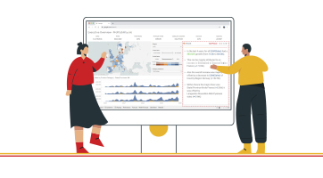
8. Design the dashboard to be more interactive
An interactive dashboard comes with plenty of benefits, such as filtering information, viewing data from myriad perspectives, and more. Modern BI solutions can connect users to diverse data sources in less than a minute and carry out the required data analysis. This makes it easier for a user to drill down and use advanced dashboard filters to suit their requirements. Interactive dashboards help combine corporate data and KPIs in a central platform where various functions and processes can get actionable insights.
9. Highlight important information to be displayed in a dashboard
Often information displayed in a dashboard is not noteworthy and can be discarded. Nondescript data can further mask unexpected anomalies, patterns or trends that could be vital. Hence, it is essential to highlight potential issues or opportunities to be visually apparent to users. Additionally, alerts can also be incorporated in dashboards to complement them and notify people when blatant aberrations take place.
10. Conduct a periodic content review session of dashboards
Clutter is part and parcel of data management. New content is constantly added to a dashboard, leading them to be more cluttered and incomprehensible. Alternatively, chances of a dashboard being neglected and gradually becoming stagnant, leading it to be less and less relevant with time, are also possible. These situations call for a periodic review of dashboards to ensure that they are focused and aligned to the business priorities. An audit of dashboards is crucial to ensure that the insights are relevant and in line with the business' goals.
In conclusion…
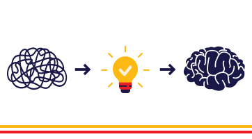
Creating dashboards takes a lot of careful planning and strategy. Analysts could create the most aesthetically pleasing data visualizations through charts and graphs and yet, there are high chances of failing to deliver the information required by the user clearly. Surely, some mistakes could be made during the creation of dashboards or when determining its use cases. However, by carefully understanding what is required of the data and the general attitude of the users, a lot can be achieved through optimum use of dashboards!
Following the points mentioned above, we suggest you systematically evaluate if your dashboards are functioning as expected. If not, you can reach out to the Phrazor team and let us help you with the solution.
About Phrazor
Phrazor empowers business users to effortlessly access their data and derive insights in language via no-code querying