2016-06-14 00:00:00
4 min read
The market for financial products, online loans in particular, has evolved over the years, with metropolitan cities such as Delhi/NCR, Mumbai, Chennai, Pune, and Bangalore driving growth in the market. Most of you would have heard and used portals like policybazaar.com,bankbazaar.com, paisabazaar.com etc for evaluating financial products online. For the uninitiated, these portals act as discovery platforms and generate instant customized rate quotes on loans, credit cards, and insurance products. As per the statistics mentioned on some of these portals, most of them cater to millions of customers spread over thousands of cities across India.
So, let’s say if I were a Product Manager at an online loan aggregator. As part of my responsibilities, I would be definitely tracking metrics like
- the total volume of loans applied through the platform
- the weighted average of interest rate across those loans
- the total number of loans applied per city/state
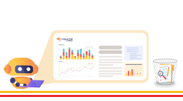
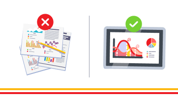
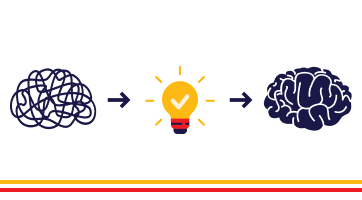
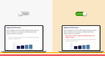
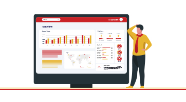
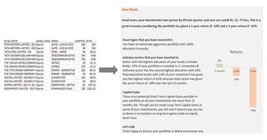
Usually, these metrics would be provided to me in charts and graphs by an analytics solution on a daily basis and I would be running various algorithmic rules to slice and dice the data further. Usually, the charts and graphs may not be the most efficient way for me to understand the nuances lying in the data.
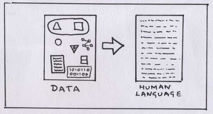
I would end up missing a lot of interesting insights due to the limitations of my intellectual capabilities to make sense of correlations between large sets of data. What if, while analyzing the charts and graphs, I also had the option of being dynamically presented with narratives at the side.
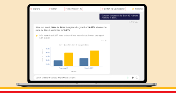
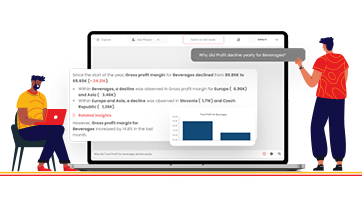
For e.g. Let's say I am viewing charts which are depicting the total variance, distribution ranges, and standard deviation of the volume of loans applied per state/city. Chances are quite high that I might miss out on insights that aren’t as obvious and direct as per the information on the screen.
However, if I had a narrative extension that dynamically delivered me insights in natural language for the same chart, it would be a lot more efficient and effective a way to understand the information in real-time. I could also use the narrative to publish the findings in an internal newsletter to the management team and relevant stakeholders.
So, in a short time, I would be able to derive meaningful insights from thousands of loan applications than breaking my head over seemingly disjointed sets of charts and graphs.
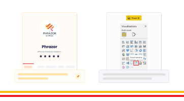
In isolation, data visualization through charts and graphs doesn’t resonate emotionally with the audience. This is where augmented BI solutions like Phrazor bridge the gap. Phrazor, a self-service artificial intelligence report writing platform generates narratives to complement data visualization to convert meaningful data into unforgettable data stories.
About Phrazor
Phrazor empowers business users to effortlessly access their data and derive insights in language via no-code querying