2023-09-13 00:00:00
min read
Are you tired of waiting for your Power BI reports to load at a snail's pace, while you watch the infamous spinning wheel of frustration spin endlessly?
Do you find yourself wondering why your meticulously crafted visualizations and data models seem to be taking an eternity to render?
You're not alone.
The need for speed in Power BI reports is a concern shared by many of us. In the fast-paced world of data analysis, sluggish reports can hinder decision-making, frustrate users, and leave you yearning for a more efficient solution. Fortunately, there's light at the end of the tunnel. In this blog, we'll delve into the critical topic of report performance in Power BI and provide you with a roadmap to accelerate your reports.
Data Source Optimization:
In Power BI, your data source is the foundation upon which your reports are built. Its efficiency and compatibility can significantly impact the speed and responsiveness of your reports.
Significance of Data Source Selection
To put this into perspective, consider the difference between fetching data from a well-structured, indexed database versus extracting information from a colossal, unindexed spreadsheet. The former operates like a well-oiled machine, while the latter can feel like slogging through a swamp.
While building Power BI Reports, selecting the right data source is akin to choosing the right tool for the job. It's about efficiency, speed, and a smoother ride throughout your report-building journey.
Choosing Efficient Data Connectors
Power BI offers a wide range of connectors, each tailored to different data sources. For example, if you're dealing with data stored in a SQL Server database, utilizing the native SQL Server connector is often the most efficient choice. Similarly, for cloud-based data, connectors like Azure SQL Database or Power BI Dataflows can provide speed advantages.
Now, let's discuss how to optimize data source connectivity for both SQL Server and Excel:
SQL Server:
If you're dealing with data stored in a SQL Server database, it's essential to use the native SQL Server connector in Power BI. This connector is optimized to communicate seamlessly with SQL Server databases, leveraging their indexing, query optimization, and data retrieval speed. Additionally, you can improve performance by applying appropriate filters when connecting to the data source. For instance, if your report only requires data from the last 12 months, you can use SQL queries or view creation in SQL Server to pre-filter the data, reducing the amount of data transferred to Power BI.
For Excel Files:
Excel files, while versatile, can sometimes be the culprits behind slow reports. To optimize data retrieval from Excel, consider cleaning up and organizing your data within the Excel file itself. Remove any unnecessary columns, rows, or formulas that you won't use in your Power BI report. Also, ensure that your Excel file is well-structured with clear headers and consistent data formatting. When connecting to Excel in Power BI, use the Power Query Editor to filter, transform, and shape the data before it reaches your report. This way, you minimize the data size and complexity Power BI needs to handle, resulting in improved performance.
Data Modeling Best Practices:
Now that we've fine-tuned our data sources for maximum efficiency, it's time to dive into the heart of your Power BI report: the data model. Think of the data model as the blueprint of your report; a well-structured one can significantly impact performance, while a convoluted one can lead to bottlenecks and slow queries.
Imagine you're tasked with finding a specific book in a massive, disorganized library with books piled haphazardly. It's a time-consuming and frustrating endeavor. In a similar vein, a poorly structured data model can make it challenging for Power BI to locate and retrieve the data needed for your reports efficiently.
Reducing the Number of Tables and Columns in your Data Model
Reducing the number of tables and columns in your data model can have a profound impact on report performance.
For example, let's say you're analyzing sales data. Instead of creating separate tables for daily, monthly, and yearly sales, you can consolidate this information into a single table with date hierarchies. This not only simplifies your data model but also improves query performance by reducing the number of tables Power BI needs to navigate.
Creating effective Relationships and Hierarchies
When setting up relationships between tables, choose wisely. For instance, if you have a Customers table and an Orders table, establish a single relationship between them based on a unique identifier, like a CustomerID. Avoid creating unnecessary relationships that could lead to ambiguity and slower queries.
Hierarchies, on the other hand, provide users with a structured way to drill down into data. Suppose you're working with a product sales dataset. Instead of having separate columns for Product, Category, and Subcategory, create hierarchies that allow users to navigate seamlessly from broad categories down to specific products. This not only enhances the user experience but also optimizes query performance by reducing the need for multiple separate queries.
DAX Optimization:
Now that we've laid a solid foundation with our data sources and data model, let's venture into the world of DAX (Data Analysis Expressions), the language that powers our calculations and measures in Power BI.
To learn more about DAX Functions in detail please refer to our blog: https://phrazor.ai/blog/What%20is%20Power%20BI%20DAX%20-%20A%20Complete%20Guide
The Impact of Complex DAX Calculations on Report Performance
Imagine you're tasked with calculating the average monthly sales growth rate for a vast dataset with millions of rows. If your DAX formula for this calculation is overly complex or not optimized, it can slow down your report's responsiveness. Complex calculations can strain your system's resources, causing slower rendering times and longer data refresh periods. Therefore, it's vital to strike a balance between achieving the desired analytical depth and maintaining report performance.
For example, let's say you're calculating year-to-date (YTD) sales. A straightforward DAX measure may suffice, but if you start nesting multiple calculations within calculations, you risk creating a formula that's challenging for Power BI to process efficiently.
Tips for Writing Optimized DAX Formulas
Optimizing DAX formulas is about finding the most straightforward and efficient way to achieve your analytical goals. Consider breaking complex calculations into smaller, manageable steps. For instance, instead of crafting a single DAX formula to calculate cumulative totals, you can create a calculated column in your data model first and then use a simpler DAX measure to aggregate those values. This not only improves performance but also enhances formula readability and maintainability.
Moreover, avoid using overly detailed DAX calculations when summary data will suffice. If you're displaying aggregated values in a report visualization, use DAX functions like SUMX or AVERAGEX to summarize data at the appropriate granularity instead of calculating individual row-level results. This way, you're letting Power BI do the heavy lifting and aggregating the data at the database level, resulting in faster query performance.
Best Practices for Designing efficient Visuals
To strike the right balance between aesthetics and performance, consider these best practices for visual design:
Limit Visual Complexity:
Opt for visuals that convey your message effectively without unnecessary complexity. Choose the right chart type for the data you want to visualize, and avoid overloading visuals with excessive detail.
Use Aggregations:
Utilize aggregated data whenever possible. Aggregations reduce the amount of data Power BI needs to process, resulting in faster reports. For example, rather than displaying raw daily sales data, consider presenting monthly or quarterly summaries.
Optimize Image Sizes:
If your report includes images, ensure they are appropriately sized and compressed. Large, high-resolution images can slow down report rendering.
Simplify Interactivity:
While interactivity is essential, avoid overwhelming your report with too many slicers, filters, or drill-through actions on a single page. Prioritize the most critical interactions for your users.
We've explored the critical waypoints along this path, from optimizing data sources and refining data models to mastering the art of efficient DAX and striking the right balance in report design. By implementing these strategies, you're poised to deliver reports that not only captivate your audience but also respond with lightning speed to your users' demands.
Remember, the key lies in the harmonious interplay of data efficiency, calculation finesse, and visual elegance. So, go forth and empower your reports to run faster, smoother, and more impressively than ever before. Happy reporting!
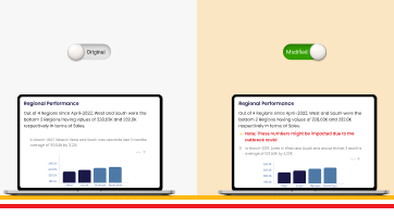
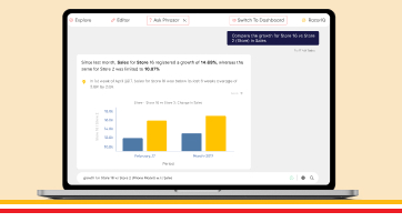
Phrazor helps you summarize Power BI and Tableau dashboards in language using AI.
Leverage Phrazor to generate crisp insights with reasoning, drive adoption of your dashboards and to get language-based insights for non-technical stakeholders.
About Phrazor
Phrazor empowers business users to effortlessly access their data and derive insights in language via no-code querying